Tips & Knowledge
How to Customize Your Shopify Storefront to Make Rental Impossible to Miss
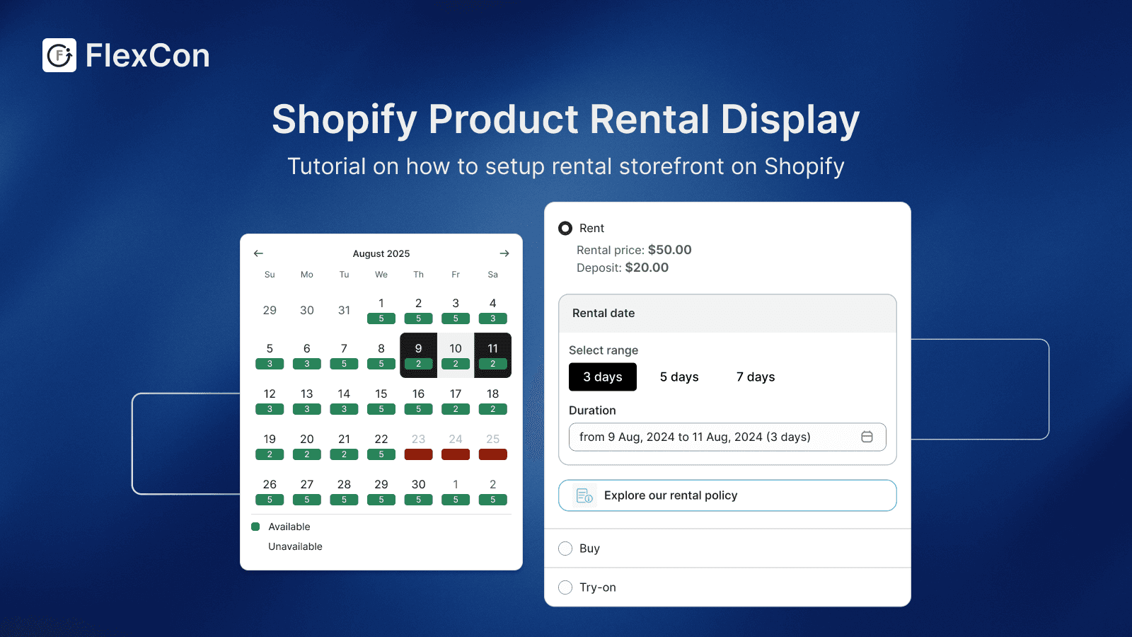
Adding rental functionality is only half the job. The real challenge is making sure visitors recognize it instantly when they land on your store.
Most users come with a default mindset:
“This is a store where I buy products.”
Your storefront needs to break that assumption within seconds and clearly communicate:
“You can rent here.”
This guide shows you how to customize your storefront so rental becomes visible, intuitive, and actionable.
Why storefront customization matters
Even with a fully configured rental system, users won’t engage if they don’t see it.
A typical Shopify store is optimized for:
browsing products
adding to cart
purchasing
But rental requires a different flow:
selecting dates
checking availability
booking instead of buying
That’s why many rental integrations replace the standard “Add to cart” with a “Book now” experience and date selection, making it clear that users are reserving, not purchasing.
👉 Your storefront is where this behavioral shift happens.
1. Make rental visible from the first screen (Homepage)
The homepage is your highest-impact surface.
What to add:
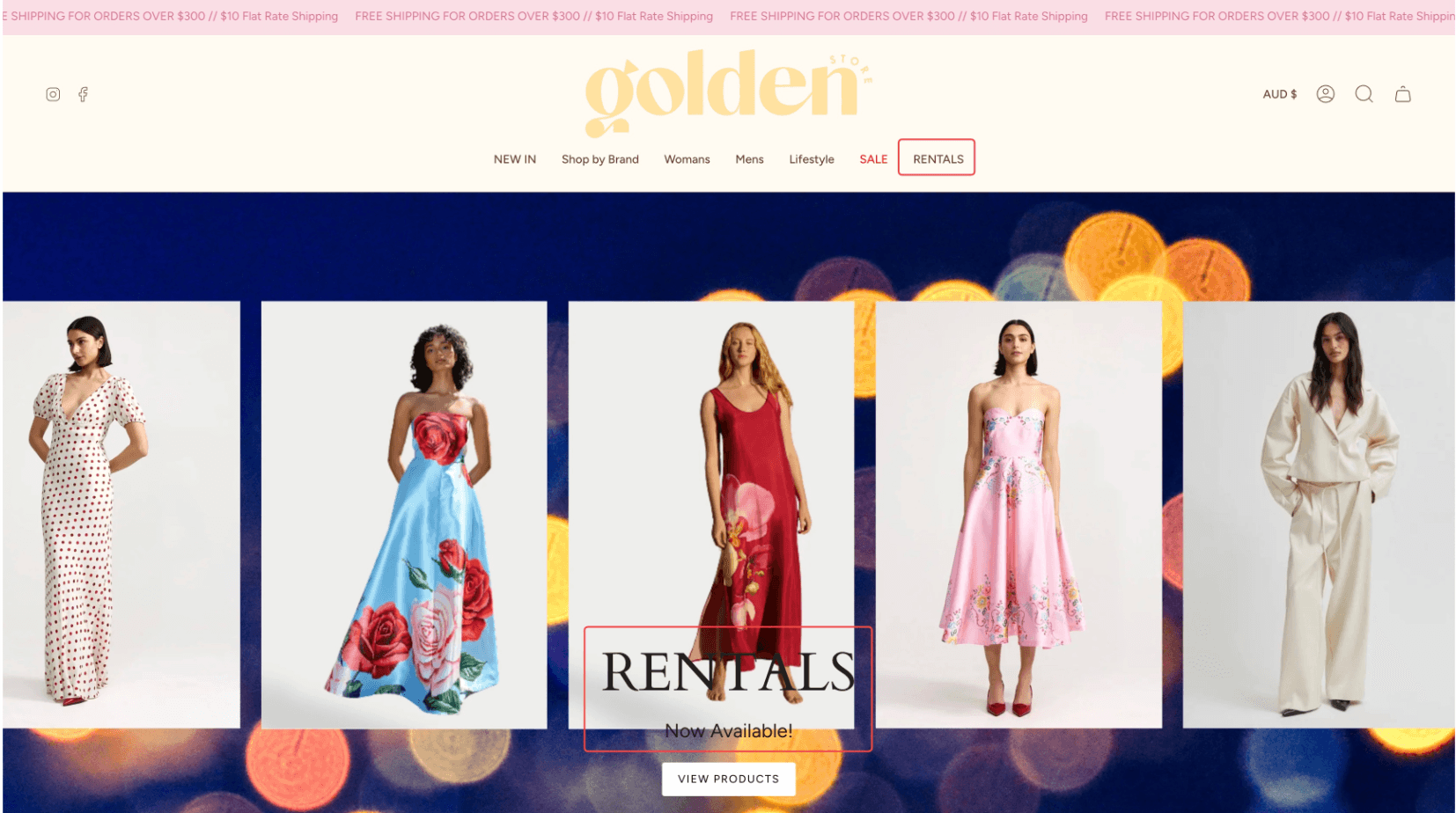
A hero banner with clear messaging:
“Rent instead of buy.”
“Available for rent.”
A primary CTA:
“Browse Rentals”
“Start Renting”
Why it works:
Users decide within seconds if your store is relevant.
If rental isn’t visible here, they won’t look for it.
👉 Think of this as your first signal of business model change
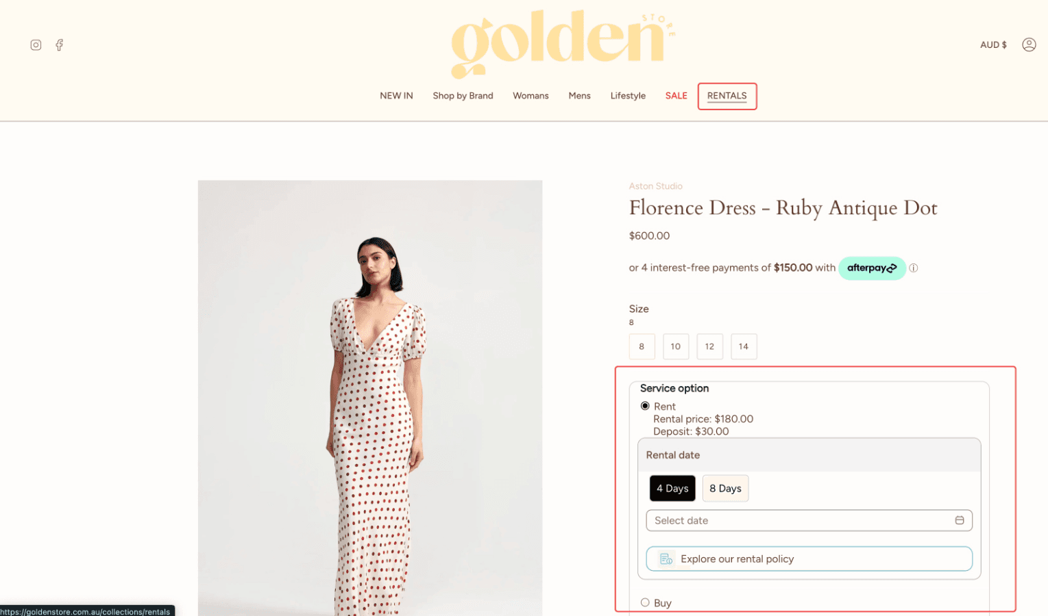
2. Add a dedicated “Rentals” entry in navigation
Don’t hide rental inside product pages.
Best practice:
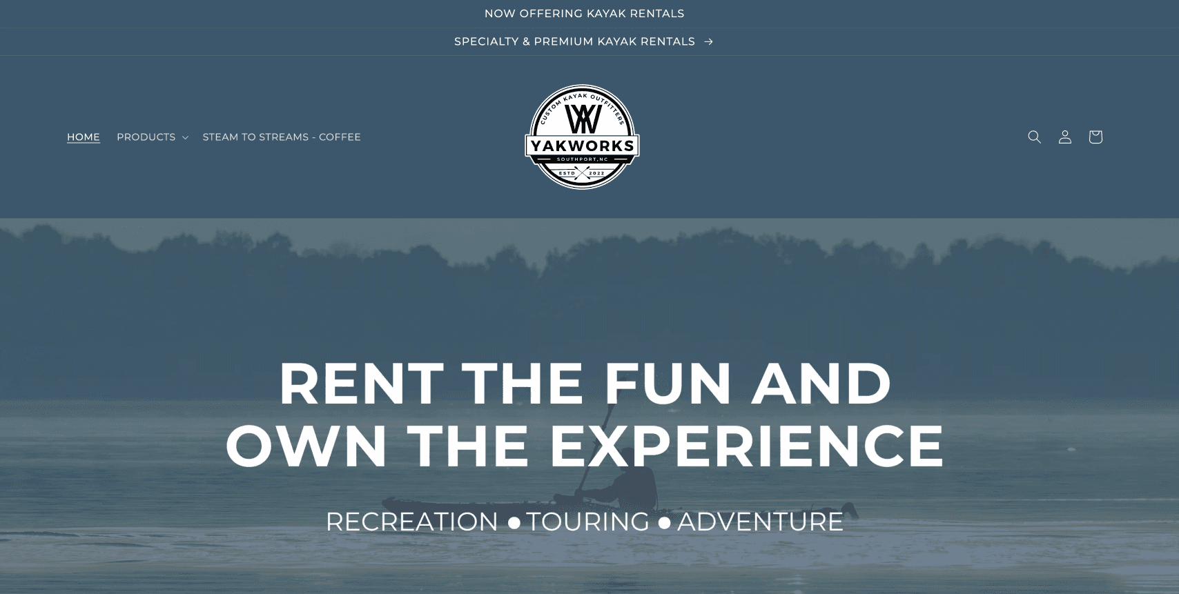
Add a top-level menu item:
“Rentals”
or “Rent”
This can:
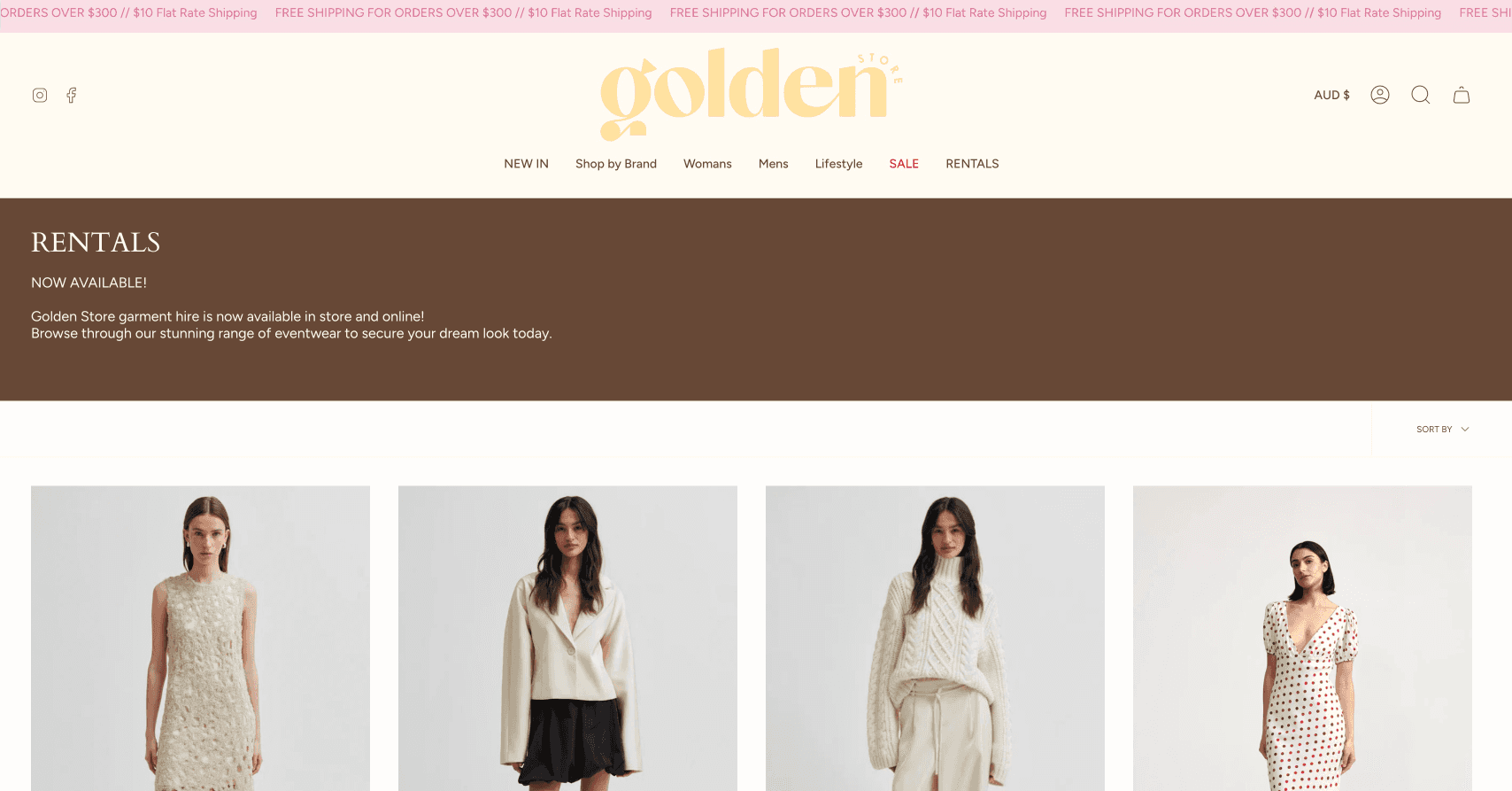
link to a rental collection
or direct users to a booking page
Many setups use a separate rental section or booking page linked directly from navigation, allowing users to browse and reserve items easily.
Why it matters:
Navigation defines how users explore your store. If rental isn’t there, it feels secondary—or worse, invisible.
3. Replace “Buy now” with rental actions
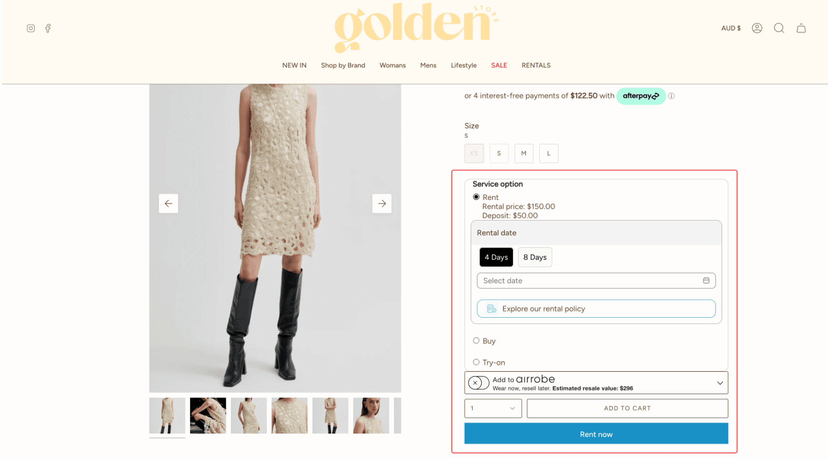
A rental store needs more than a standard “Add to Cart” button. Customers need to select rental dates, check availability, and understand the booking flow before checkout.
With FlexCon, you can easily add the FlexCon rental block to your Shopify product page through the Theme Editor.
To add the rental block:
Open Online Store → Themes → Customize
Navigate to your product page template
Click Add block
Select FlexCon Rental Block
Save your theme changes
Once added, make sure the rental block is displayed near the product price and purchase section so customers can easily see the rental options before taking action.
The rental block allows customers to:
Select rental dates
View availability
Choose rental duration
Add rental items to the cart properly
This creates a much smoother rental experience compared to using a standard e-commerce product page.
4. Show availability and dates upfront
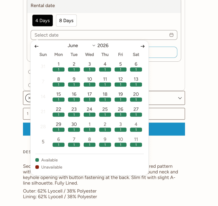
Rental is time-based. Your UI must reflect that.
Add:
calendar selector
availability status
real-time booking feedback
Displaying availability directly helps prevent confusion and builds trust, since customers only see items they can actually book.
UX principle:
Availability is part of the product, not an extra feature.
5. Use sections to explain “How rental works.”
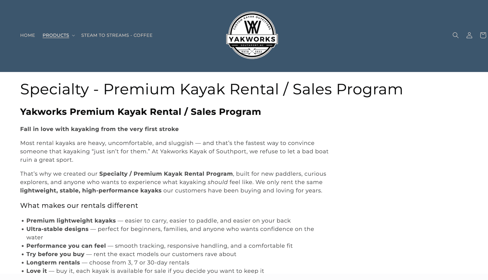
Unlike traditional ecommerce, rental stores often require customers to understand additional steps, such as booking dates, product usage, return timelines, deposits, or late return policies.
Instead of only adding a short “How it works” section on the homepage or product page, consider creating a dedicated page that clearly explains your entire rental process — from placing an order to returning the product.
Your guide page can include:
How to book a rental
Rental duration & availability
Delivery or pickup process
Deposit information
Return instructions
Damage or late return policies
FAQs about rental flow
This helps customers feel more confident before making a booking decision.
You can also link this page from:
Homepage sections
Product pages
Navigation menu
Product FAQs
Cart page
Why it matters:
Rental introduces more decision-making friction than standard e-commerce. A clear rental guide reduces confusion, builds trust, and improves conversion by helping customers understand exactly how your rental process works.
Example:
6. Highlight rental across multiple sections
Consistency builds recognition.
Your storefront should reinforce rental in:
product cards (“From $X/day”)
banners (“Now available for rent”)
collections (“Rental items”)
Website builders and themes allow you to customize sections like banners, text blocks, and navigation to clearly present your offering and guide users through the experience.
👉 Users shouldn’t have to “discover” rental—it should be repeated across the journey.
7. Create a seamless booking experience
Avoid sending mixed signals.
There are two common approaches:
Embedded experience
Rental UI lives directly inside your store
Users select dates on product pages
Separate rental section
Users click “Rentals” and go to a booking page
Both approaches work, but the key is:
The experience must feel intentional and consistent
Common mistakes to avoid
1. Treating rental as a hidden feature
→ Users never find it
2. Mixing buy and rent without clarity
→ Confusion, lower conversion
3. Keeping standard e-commerce UI
→ reinforces wrong behavior
4. Not explaining the flow
→ users hesitate to try
What’s next?
Now that your storefront clearly communicates that your store offers rental, the next step is to:
→ Turn your products into fully functional rental listings (Next blog)
This includes:
enabling date selection
setting up availability
configuring rental pricing rules
If your storefront is done right, users won’t need to figure anything out.
They’ll immediately understand what you offer, how it works, and how to start renting.